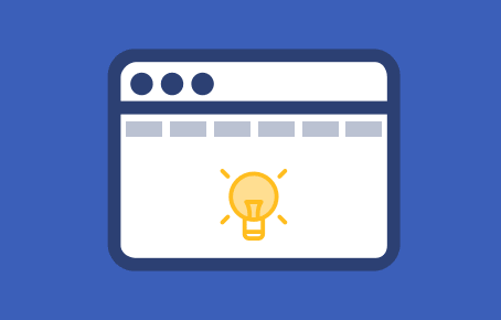
When we talk about web usability there is a basic aspect that we always have to try if we want our website to meet a minimum requirement and is nothing other than web browsing.
When a user searches for sports results on a sports website, when another searches for a specific clothing store in a fashion store or when a third party wants to download documentation from a web portal, web browsing must be perfect and conscientiously planned for that users find what they are looking for in a clear and fast way.
And this does not only affect where we put the menu, but the number of levels that we are going to have, the number of links, the nomenclature of the sections and many other aspects that we have to analyze so that the access to the information of our web page is fully effective.
In this article we will highlight the 4 keys for a correct web navigation that we think every webpage should take into account.
1. Be concise
Less is more. At least as far as web browsing is concerned. It seems silly, but the more extensive our navigation menu, the more mental chaos we will create in our users since we will probably force more than one to decide between options that will not seem very clear and will go forward and back several times until find it what they are looking for.
It is studied that in navigation menu of a web page the maximum limit of sections must be of seven. It is easier for the user to have the menus short and group more sections because they also more easily retain the route to follow to get the information that interested them.
Also, if we are interested in having some subsection have more prominence we can always create blocks in the home section that link directly to them. It is an easy and effective solution.
2. Be clear
It analyzes, selects and organizes with criteria, with clear and transparent names the links of the sections of your web navigation menu. These names have to make it very clear, what will be the information that will be found in each of the sections. It is undoubtedly one of the keys to correct web navigation.
Reduce the confusion of your users by avoiding sections that have similar names. Uses names or tags that are implanted in the general web navigation. Don’t try to be creative in this aspect if you are looking for is that the users of your web page arrive fast to the information that interests them.
Also do not use links that do not look like links. Create the buttons have a button shape. Above all, have common sense. A user who has “lot of work” to access the information, content or seeking documents won’t want to return to your website.
3. Homogeneity
If you want your users to know how to navigate your web page and do not get lost and able to access any type of information, you have to create a structure with a homogeneous design. And here we do not only talk about the navigation menus, but the sections that offer links to other parts of the web.
If in several sections we have a different structure and with elements that for example lead us to a contact form, make these elements equal or at least similar. Let the user easily understand the functioning of your web page.
4. Hierarchy
Another interesting point that we must be clear is that if we use a correct hierarchy when ordering our web elements, we will facilitate the navigation of our users because they themselves will understand quickly that it has more importance and that less, that encompasses to what and where find certain information.
For this it is important that our web hierarchy is clear and easily understood. For this the easiest is to resort to design. Use fonts, thicknesses, sizes, colors, details or elements that quickly identify the importance of each block in our website.
Making the user understand this point at the time that visits our website is fundamental and it is last recommendation within what we could encompass as the keys to a successful web browsing.